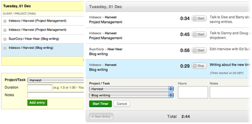
Last week we pushed through a major interface overhaul for our timesheet section. We’ve spent a lot of time thinking, designing, and tweaking the experience, flow, and interface elements on the timesheet – and we’re really excited about the latest improvements. Here’s a summary of what we have done, and why.
Overall Structure and New Skin
The new timesheet might look completely different from the old one, but we have maintained the overall architecture from the previous design. We experimented with different layouts that could have improved the experience and speed of the timesheet, but in the end, we decided to not introduce such a radical change for our current users.
The biggest change you’ll notice is the new silver, metallic skin. The old look was yellow and boxy – and completely out of date (it is three years old, after all). We wanted to sport a fresher, lighter look. We stripped out unnecessary lines and headers, rounded the corners, and increased the overall font size, so that you don’t need to squint your eyes to read the 11pt text. The add entry box is now part of the timesheet, so adding and editing entries shares the same look-and-feel.
Client, Project and Task
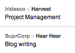
The most important pieces of information on the timesheet are the client, project and task of each entry. We used to lay out that information using one line: client / project (task). It works, but it’s hard to quickly scan down the timesheet to find a particular time entry, so we decided to improve the experience.
From our research, we found that some customers care most about which project they’re working on; other customers generally work on the same project each day, and they care more about the different tasks within the project. We wanted to design the information so that everyone can scan the lines to pick out the piece of information that is most important to them.
We broke up the information into: Client > Project, and on a separate line, the task. Client and project are naturally paired, and we gave the client name a lighter tone than the project name. The three pieces of information look slightly different, so that your eyes can quickly scan and pick out the information you care most about.
Timer and Buttons
Many new customers used to write in to ask us how to start a timer, or edit an entry. The main culprit for the confusion is the poor design of our icons. The edit control used to be the gray pencil, which, admittedly, did not look like a pencil. We’ve switched it out and replaced it with a plain ol’ “Edit” text button.
The old timer icon was cute, but it did not look like a button you can click on. Since the icon was small, our customers had to aim for that little circle to click on it. The new timer button is clearer and much bigger. The hit area includes the clock, the word “Start”, and the hours.
We also spent a lot of time tweaking the interaction, so that each button has a hit state and a visual change if you click on something. These are small details that should make the overall experience feel snappier and smoother.
Bigger Notes Area
Harvest used to have just a short one-line input box for timesheet notes, and it served many customers well. We noticed that if you had more than one line of notes, it was not only hard to type in, but when you edited it, it was difficult to find the exact place of the edit. We switched out the old input box, and replaced it with a more generous textarea, which will auto-expand as you type new lines into it.
Once we released the new interface, we quickly received feedback from many of you that the new textarea no longer allowed you hit the Enter key to start the timer, or to save your time entry. We responded by re-introducing support for the Enter key to trigger start timer/save; and for those of you who need line breaks in notes, you can still do that with Shift-Enter (like you would in a spreadsheet cell).
Under the Hood
Our development team has re-written and cleaned up the code behind the timesheet. There may not be a significant difference in the experience, but a smoother engine means a more stable Harvest Timesheet. A big thanks to Barry, Dee and Doug for carrying out this big launch!
Upcoming Tweaks
We’re not done! The new timesheet interface is still settling in for all of us, and we’re gathering feedback from all our customers. We have already been working on some small updates, and there will be more to come soon. Here’s a list of changes you should expect in the coming weeks:
- A better “Stop Timer” button. We have added the spinning clock back, and we’re going to make the animation smoother and make the button more obvious.
- On the old timesheet, the notes field was a regular input field, and your browser would auto-fill data. The new notes textarea does not support auto-complete, and we realize it’s inconvenient for some customers. We’re thinking of ways to solve this.
- We’re still tweaking the timesheet interaction to make the flow even smoother and faster.
The new timesheet isn’t just a prettier face. We’re also adding three new features: the ability to duplicate timesheets (it’s already in your Harvest account, and we’ll have a write-up soon); a recent tasks dropdown; and timestamp support. Stay tuned!
As usual – thank you for your continued support and please let us know if you have any suggestions or feedback! And in case you haven’t checked it out yet, we’ve launched the Harvest Forum, feel free to join in on the conversations!


